Monday, 30 October 2017

comparing editorial comments

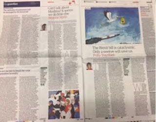
The Daily Mail and The Guardian

Differences- Daily Mail
1: more punny
2: more informal
2: less personal

Differences- The Guardian
1: more formal (detail)
2: more persuasive


Similarities
1: small masthead
2: column style- text based (no images)
3: persuasive tone
4: based on current affairs
5:different comment articles

Both newspapers have used an authoritative and persuasive tone to show that they feel strongly about their opinions. However, the Daily Mail uses more word play amongst their opinions. It is noticeable that The Guardian has a higher level of vocabulary compared to the Daily Mail, including figures of speech such as metaphors, lists of three and emotive language.Using the theory of Uses and Gratification we can see The Guardian and The Daily Mail fulfil the four forms of media. These include identity, education, entertainment and social interaction. Uses and Gratification begins with identity, this is being able to recognise the product or person in front of you, role models that reflect similar values to you, aspirations to be someone else. This then leads onto education. This when we are able to acquire information, knowledge and understanding of a newspaper, something The Guardian and The Daily Mail do very well. This again then follows through to social interaction this is because the media has the ability to produce a topic on conversation between other people, and sometimes even sparks debates. Because of social interaction people gain a sense of 'escapism', also known as entertainment. this is when what we are consuming should give you enjoyment and also some form of 'escapism' enabling us to forget about our worries temporarily. 


Tuesday, 24 October 2017

The big issue


The big issue magazine analysis 
The front cover of this magazine really stands out due to the colour of the front page. The colours of the front page all complement each other such as red, orange and yellow. As these colours connect with each other it brings out the picture in the middle of the magazine. The Big issue have done this to draw the readers in as it the front cover so its the first thing they will see. The grey picture of Morrissey makes the magazine quite relaxed as he portrays a calm feel to it. The different colours of the text makes Morrissey stand out and as the colours link together it immediately attracts the readers eye. The overall colours of the reds, orange and white makes a happy effect and the tone of his face makes a warm feel to the the magazine. Morrissey is an easily recognisable figure in the music industry and so therefore would generate a lot of consumer interest due to his profile.  The masthead of the magazine is in the top left corner and fits in with the style and colour of font which is used on the rest of the cover, and like all big issue cover pages the masthead does not go across the entire top of the page. Surrounding Morrissey are a variety of words that describe him as a man and are style in a very effective artistic way that exaggerate the effect of the colour and are extremely aesthetically pleasing to the consumer. The font used on the cover allows for the cover to have an artistic and stylish look. The background of the cover resembles flames and fire to enhance the effect of Morrissey as the star of the cover.
This cover of the Big Issue focuses on the music view from Liam Gallagher. Who is one of the most well known names in the history of music. The layout of this magazine links with each other. The brightness of his pink jacket matches the pinkness of his lips. This is well planned out and well thought as it makes the reader draw into the magazine as it shows that it has been well designed and had time spent on it. Likewise, Liam is the second biggest image that you can see on this front cover. It indicates a very personal image towards the magazine as it shows he's well known towards the reader as it is more personal as its his first name.
Also, on the front cover he is the biggest thing that you can see as he is in the centre of the page which draws you in immidiatly.    By Liam being at the centre of the page it is easily reconasible so readers will be dragged in.
Liam is performing a pout pose to show himself to be serious and therefore create curiosity in the mind of the consumer. Due to him being such a high profile figure he is bound to create a lot of consumer interest. The catchphrase pull line used on the cover of this issue epitomises Liam's controversial and vain character, which is easily recognisable with the fans of Liam and those who understand his characteristics within the music industry. Similar to all issues of the Big Issue, the masthead is placed in the top left corner of the cover, with a simplistic style and not going all the way across the top of the page. The main cover line 'It was always all about me anyway' is stereotypically indicative of his temperamental and modest character, therefore making him easily recognisable for the consumer. In the top right corner of the cover a flasher is used to indicate to the consumer other information which they can find within the contents of the issue. The colour scheme used on the cover is very bright and exuberant, therefore immediately attracting the attention of the consumer. 

Wednesday, 11 October 2017

david guetta

David Guetta- Titanium Research 

David Guetta- The dj/music artist 


David Guetta is a french Dj, song writer, record producer and remixer. He was born in Paris,France which his where he began his Dj career. He started hosting this own night clubs and in 1990 he released 'nation rap' a hip hop collaboration with a french rapper. 


Sia (singer) 
Sia is an Austraian song writer and music video director.
She started as an singer and song writer then moved to London and provided lead vocals. Diss music portray a different message for each of her songs. Somtimes staring maddie zigler as her main dancer. She is a very mysterious song writer as she where's a wig in each of her concerts which covers her face which does the mysterious side to her and her music which could link to the music video. 


Nothing but the best the album: 

Nothing but the best is the fifth studio album by French dj and recorded producer David guetta released on 12 august 2011. It was released as a double album which features different colabourations with artists. 


Titinun song and video. 

The video of this song is very different to most videos. It does not feature any of the song writers. This could show that they want the audience to focus more on the music video and the Lyrics rather than the song and the artist themselves. The song lyrics of the song is about inner strength 

David Wilson 
 He is an English video director who currently lives in London and did a course in art and design. He has directed music videos for different artists including David guetta. 


Tuesday, 3 October 2017


Stereotypical news artical 

Radiohead

Radiohead 
The Band:
Radiohead were one of the most innovative and provocative bands of the 1990s and 2000s, five very serious Englishmen guys who developed their own sound and always tried really, really hard. 
The members of Radiohead met while attending Abingdon School, an independent school for boys in Abingdon, OxfordshireGuitarist and singer Thom Yorke and bassist Colin Greenwood were in the same year, guitarist Ed O'Brien and drummer Phil Selway the year above, and multi-instrumentalist Jonny Greenwood, brother of Colin, two years below. In 1985, they formed On a Friday, the name referring to the band's usual rehearsal day in the school's music room.

                                                      A moon shaped album:
Radiohead recorded A Moon Shaped Pool in southern France with longtime producer Nigel Godrich. It includes several songs written some years earlier; "True Love Waits" dates to at least 1995, "Burn the Witch" to 2000 and "Present Tense" to 2008. The album features strings and choral vocals arranged by Radiohead guitarist Jonny Greenwood and performed by the London Contemporary OrchestraRadiohead and Godrich began work on A Moon Shaped Pool in September 2014. A Moon Shaped Pool was acclaimed by critics and appeared in many publications' lists of the year's best albums. It was the fifth Radiohead album to be nominated for the Mercury Prize, and was nominated for Best Alternative Music Album and Best Rock Song (for "Burn the Witch") at the 59th Annual Grammy Awards. It topped the charts in several countries, becoming Radiohead's sixth number-one album in the UK and a bestseller on vinyl. It was certified gold in the UK on 24 June 2016.

                                                                                             Chris Hopewell- video director 
Chris Hopewell is an English music director he has directed videos for Radiohead and several other bands. Hopewell (who directed the ambitious stop-motion dream “There There” for Radiohead back in 2003), and his Bristol crew animated “Burn the Witch” over 14 days at his Jacknife studio.


Burn the witch  
"Burn the Witch" is a song by the English rock band Radiohead, released on 3 May 2016 as the lead single from their ninth studio album A Moon Shaped Pool"Burn the Witch" was accompanied by a stop-motion animated music video that pays homage to the 1960s British children's television programme Camberwick Green and the 1973 British horror film The Wicker ManThe "Burn the Witch" music video was directed by Chris Hopewell, who previously directed the animated video for Radiohead's 2003 single "There There". It uses stop-motion animation in the style of the Camberwick Green, Trumpton  series of 1960s English children's television programmes (also known as the Trumpton Trilogy). The video was conceived and finished in 14 days and released on YouTube one week later on 3 May 2016.
                                                             The wicker man 
The wicker man is a British mystery horror film directed by Robin Hardly.
The Wicker Man is a 1973 British mystery horror film directed by Robin Hardy. centred on  Sergeant Howie (Edward Woodward) who arrives on the small Scottish island of Summerisle to investigate the report of a missing child. A conservative Christian, the policeman observes the residents' frivolous sexual displays and strange pagan rituals, particularly the temptations of Willow (Britt Ekland), daughter of the island magistrate, Lord Summerisle (Christopher Lee). The more sergeant Howie learns about the islanders' strange practices, the closer he gets to tracking down the missing child.


Trumptonshire Trilogy
Trumptonshire is a fictional county created by Gordon Murray, in which the Trumptonshire Trilogy of Camberwick Green, Trumpton and Chigley are located. According to Murray, the tree communities are based on real locations one and a half miles from each other at the corners of an equilateral triangle. The Trumptonshire Trilogy was first shown on the BBC from January to March 1967. 

Sunday, 1 October 2017

Online digital publications


Online digital publications 


The headline of this article states that there is an terrorist attack in Paris. The adjective 'NEW'     could excite the reader and make them want to read it as "new" draws you in and makes you excited about what the story is about. The news article appeals to all every target audience. This is because, the headline states that there is an terrorist attack in paris therefor Paris is well known as a lot of family's go on holiday there as is a very popular place. So this will instantly attract the audience because of the place of the attack. This is different from the newspaper because, for this story it uses very dramatic words and has two headlines one above the main one that introduces the story then a big headline which draws the reader in as it goes straight into the story and whats happened. As the online publications go straight into the main story of whats happened i think that it has a different reader to the online than the newspaper. This is because, if its online its easer and more assessable to read so therefore, the online publications want to catch the readers eye straight away. Whereas, the newspaper copy if you have brought it you will have time to read it at home or while at work so by the newspaper having a longer and more in depth story it has a different reader to the online one as they maybe just want a update to whats happened.


The Guardian newspaper online publications
The Guardian online publications have shown different pictures than the newspaper. The headline talks about Las Vagus shooting and on the online version there is a real live video for you to watch filmed by someone who was there. This will attract more readers that like to have the visual image such as the video where rather than reading the story they can watch the video and find out the same information. Whereas, the newspaper might have a photo of what happened but it might not be clear to the reader whats happening. Therefore, the reader that has the newspaper will prefer reading rather than videos and images to describe what happened.


Dj photoshoot

   For this photo i used the key light and also used the fill light. This therefore, created a dark shadow behind him, whic...